As well as deciding which photos to include in my magazine, I have also had to decide which photos not to include in my magazine and why I won't include them
The photos I won't use and the reasons why I won't use them
I won't be using this face as my model is covering her face, and is not in any sort of position that would fit in with the genre of my magazine
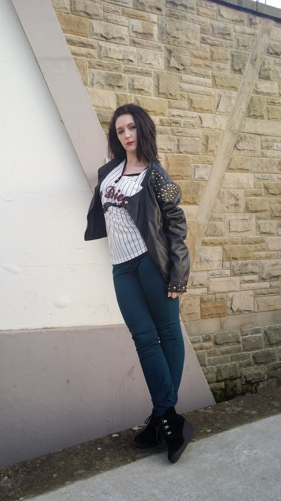
I won't be using the photos above as my model is not in a serious pose that I could use in my magazine
The light in these photos more or less ruins the photos, I believe they look to innocent now and too bright, the contrast doesn't go with the poses in the photos above.
In this photo my model has her eyes closed, therefore it shan't be used in my magazine
In these photos above the wind ruins the photo as it distracts the model, also the facial expressions she is pulling doensn't go with the genre of my magazine. At times the light is too dark as well and makes her face look darker than every other feature in the photos.
I have used a simillar looking photo for my double page spread, I decided against these for reasons such as she has her eyes closed and she doesn't look ready for the photot to be taken in the photo above this one.
In these photos we tried a different angle where I took the photo from above the model and in line with the model. On the photos where I take the photos from above I thought that maybe I could use one of them in my double page spread, however I have decided on a different photo for my double page spread.
I have a photo that looks simillar to this one and I won't be using duplicate photos like the two photos above.
The photos above are all more or less duplicates or very simillar looking, we tried photographing from a distance, however the light ruins the image and so does the wind in some photos. Also some of the facial expressions don't look very professional for the magazine.
These two photos above are too close to her face and the facial expressions don't match what the readers are used to seeing in a music magazine, the photos are also rather blury and un clear.
This photo is extremeley blurry and out of focus and therefore it cannot be used
All the photos above are all duplicates and I have selceted one that I believe looks better than these duplicate photos
These photos above are all duplicates as well and I believe they look too seductive and too cheap to put in my magazine
I believe they look too seductive and too cheap to put in my magazine but I took them to use as examples of photos I don't want to use
This photo was taken in between two other photos, as she was changing her facial expression I took the photo, it doesn't look professional and it wouldn't look very good in my magazine
These photos are duplicate photos and I have the third photo which I believe looks better
These photos are duplicate photos so I wouldn't put them all in, also these were taken just to see what they looked like and if I would want to put them in my magazine; which I don't, I don't think the light looks very good in the background, the wind was working against us and there are cars in the background and to edit them out my make the photos look worse
This photo has lost focus and the model doesn't look ready to have her photot taken; for that reason I will not be using it in my magazine
Most of the photos above are very simillar or copies of each other, I have a photo like the ones above that I believe looked better than the rest. In a lot of the photos above the light is too dark and there is always a risk that if it is edited that the photo will look eidited or fake.
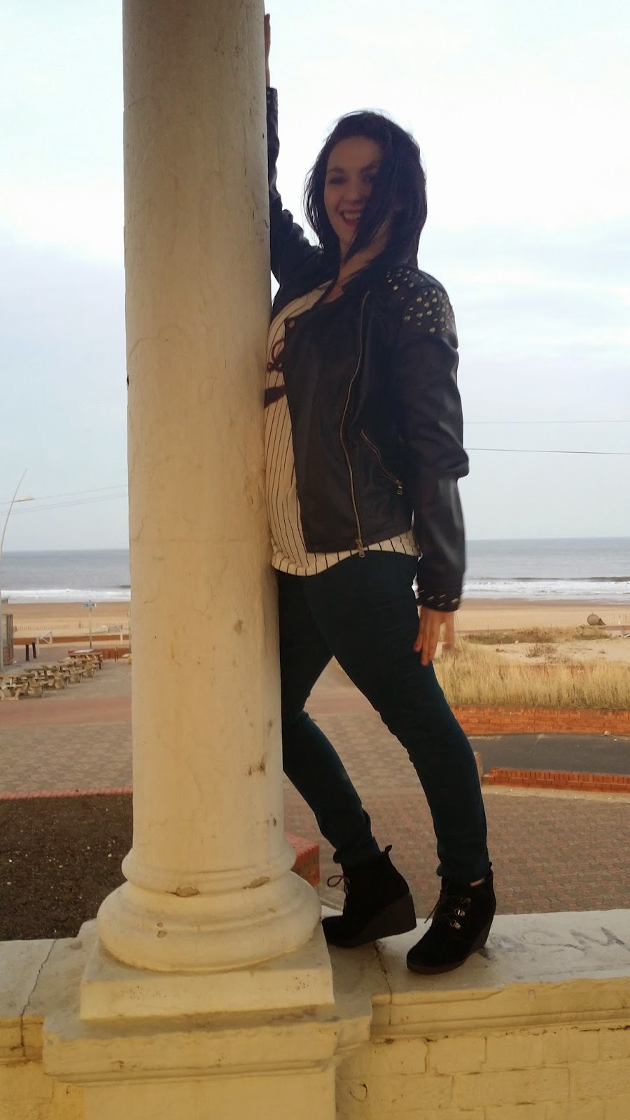
And in many of these photos she is too happy and not posing the way the genre of my magazine demands
This photo would not be of any use to me, as we can't see her whole body and it is badly blurry and out of focus
These three photos above were also to see how the photos would look at a different angle, so these photos are taken from below the model. I believe these photos make her look arrogant which wouldn't look very nice on or in the magazine
These two photos above are duplicates of a photo I have, also the top photo is slightly blurry and not of very good quality so I shan't be putting them in my magazine